Monday, August 31, 2009

Print Preview: Forest Floor

I am in the midst of a printing break-- I've pulled around 100 woodcut prints off 5 plates over the course of last night and this afternoon. My whole right arm is very upset about the repetitive brayer and spoon action, and my neck is stuck in a downward position.

Here's a new guy from the bunch:

I think this is an autumn print. My sketch started with a single leaf, the oak in the center. Then I drew a few more, added an acorn, and before I knew it, I had the perfect ground cover on a brisk October day.


So I printed it up on this cardstock that's a cross between butternut squash and mustard yellow. And, to see what would happen, printed it on some kraft brown, white, and green too. They all look really different. I plan on attempting to hand color the white in a few days once my ink is dry. I don't usually care for this look, but it might just work with this one.

This print will be up for grabs this weekend at the Jamboree at Riverside Park, and on Etsy shortly. A couple of simple screen print editions were in the schedule for tonight-- hopefully my neck straightens out by then!

Monday, August 17, 2009

Changes

So as I've mentioned, I've spent some time over the last month or two working on a bit of branding by creating a coherent 'look' to attach to everything. I do a lot of this in my day job, so I get a little nerdy and excited about it. The fortunate part about what I do by day is that we get to change the merchandising look everytime a flyer comes out-- with my prints I wanted something that could last me at least a year... because consistency is generally a good thing. Anyway, first I started with a drastic redesign for my shop banner, which I carried over to marcydavy.com and the blog. I found, fell in love with, and committed to using Turnpike, my favorite typeface as of late, occasionally mixing it up with a nice script that's easy to read (its called Little Days, and is free at Dafont I believe)

I'm loving a good mix of script and classic mid-century sans-serif right now, so these two make a sweet pair. I've been doing the same in my signs at work, but with Black Jack type face, because the changing line weights and crispness seem to work well on an advertising level. Here's examples.

You might recognize Black Jack from BohBon Soap's super-sweet packaging.

Speaking of soap, Chrissy at BohBon makes some heavenly soaps that are nice and gentle and smell pleasing and earthy. I'm a big fan of Gypsy Spice and Earth Mama Goat Milk. And, I haven't smelled Rifferaff's soaps yet, but Shannon wraps them in hand-printed paper and uses real Michigan honey in them and they look good enough to eat!


Last tangent, I swear. So when the time came to put together some retail packaging, I used these fonts again. This is some drawn and scanned woodgrain, with a title on the front, info and links on the back, and a cute little retro price circle. I added the leaf on the other side for some balance.


Next, I reimagined my business cards. For the fourth time this year. I'm not even kidding-- take a look!


The top left was my first card. I threw it together very quickly last summer, printed it on some cardstock, and cut it up myself. Late last year, I started ordering them from 123Print, which has a lot of sweet contemporary designs-- this one was perfect. When I was in a pinch because I never remember to order more, I spent an evening printing them up on my ink-jet at home on textured cardstock in a long skinny ticket size and cutting them by hand. That particular incarnation has the most info on it-- too much in my opinion. When it came time to COMMIT to a design for awhile, I decided that I wanted something that was simple and had a handmade feel.


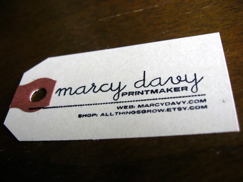
I designed and ordered a self-inking rubber stamp from Vista Print (I scored a half-off deal and paid $8.99!) and am stamping these on simple manila shipping labels. I have been using these shipping labels to tag work for awhile, I love how simple and recognizable they are. My favorite part about these stamps is that they're the first that actually utilize printmaking in their production. I love the little imperfections between one and the next!

Now that all of these merchandising changes are wrapped up, its time to get back to work on the prints that they're selling!

Sunday, August 16, 2009

For the Win!

Hiawatha Birches and Robin's Nest are both currently featured and for sale on the prints section of the Renegade Handmade online shop! I have just one more of these left in my inventory at home right now, but I'm thinking about another similar edition for fall.


And I have another new woodcut in the works-- working title: forest floor. When its done I'll show it to ya! I'd also love to throw up some photos of my newly designed retail packaging and business card stamp one of these days! I really need to find more time-- hopefully this nice weather will subside soon and I can go back to holing up in the apartment with my ink and ideas. How do you people in temperate climates get anything done?!

Sunday, August 9, 2009

The Pendulum Swings!

I sometimes wonder if I have what it takes to make work full-time, because the process of creating is a bit tricky for me. I need everything to feel right-- I can't come home and dive in if I've had a bad day, or I'm thinking about my bills. My surroundings need to be organized and peaceful. And then, once everything is in place for the show, I have to pull back the curtain and not recite, but invent my lines.

And then I have to trust whatever story those lines tell-- sometimes they are pulled more toward one type of subject matter, or medium, or color palette. Sometimes I don't feel like I have a whole lot to do with what direction I'm headed in-- there's an intuition at work that just takes me there.

Such is the case with the recent prints. I've spent months working almost exclusively on screen prints, only reverting back to woodcuts when I need to pull a handful off the same plates I've been using since last winter. I've reopened and touched up a few new pieces, but haven't made anything new in awhile. Ok, that's not true, I did cut up a plate a few months ago and I hated it. I had been thinking about it for forever, and it seemed just fine when I carved it, and then I pulled the print and I hated it. That doesn't happen very often these days. So I told myself to put it 'behind the couch' as an art teacher once told me and come back to it later. Later turned into the better part of two seasons.

And then, like a spark, it comes back. Its hard to explain how this happens when you work in two mediums exclusively. I did come close to an explanation by way of a blog post by amazingly reflective an articulate fellow Etsy seller Allison Sattinger of Sunny Rising. If you compared art to real-world jobs (ha!) the two types of prints I make would be like working in related jobs in the same field-- say chemistry and physics. Allison's working life, in silversmithing and leather tooling, is more like bouncing between ballet and construction.

Here's an excerpt from her blog that sums up this duality in ways of making perfectly:


I cannot breathe in enough of the scent of leather
nor can I seem to tool enough....
The pendulum which had swung to silver for so many weeks has swung to leather
one field lays fallow while another is seeded and harvested -
that's the way to keep the earth full of nutrients
and the mind blossoming with ideas and activity.

I can relate entirely. So, my pendulum appears to be swinging back toward woodcut prints, which is too bad because I just bought a $40 gallon jug of screen print ink. Today I made a woodcut from start to finish, and I thought I'd give you a little 'making tour'


So first I draw the image on the plate. The plate is the same size as the paper the print will go on, so I decide on a border size first. Then I draw the image in pencil, and again in black sharpie. The black sharpie is great for this because you get lines with about the same weight as your finished product, not too fine in the detail department. Then I cut away all of my line work with a Dremel tool with small sanding attachment. This is where I depart from most relief printers, who use hand tools. The Dremel cuts approximately 99% of the time away from this process-- with the added bonus of not swearing under my breath or cutting my hands. The vibrating does require occasional breaks because your hand will go numb.


All carved away-- the Dremel cuts curves with ease, this would be nearly impossible with hand tools.


Next I make a frame from paper and tape with a hinge on one side. After I ink up the plate I can swing this frame over the print to prevent ink around the edges from touching the paper.


Then I squeeze some ink out of the tube, loosen it up with a palette knife, roll it out with a brayer, and ink up the plate. At this point I can see where I'm going to want to go back in with the Dremel later and touch up some leaves.


Then I put a piece of paper on top, push the ink into the paper with a wooden spoon and voila! Finished product. This is called Bracken Fern :)


Here's a close-up of the wet ink. I use oil-based inks because I think the texture is so must finer and smoother after the drying process is complete. This print will take around 2 days to dry completely, at which time the ink will feel and look almost like suede.

I've been feeling the need to switch my subject matter from one process to the other-- so in addition to seeing woodcut prints with ferns, leaves, stones and other subjects from my screen prints, I am starting to envision screen prints with the nests and rock formations and roots. Hopefully new inspiration with intervene at some point as well.

If you're looking for a more in-depth explanation of how woodcut prints work, I recently posted a PowerPoint tutorial to my web site that you can download or view online. Maybe your pendulum will swing toward woodcut prints too!

Thursday, August 6, 2009

The End of Summer

I'm winding down summer with a handful of shows-- now that they're all confirmed, I thought I'd share.

First up!


August 14 & 21, 7-10 pm
Crossroads Summer Festival, Ypsilanti
Washington Street/Downtown
A free summer concert series Friday nights through August in historic downtown Ypsilanti. I'll be selling framed woodcut prints and screen prints two Fridays in a row!


Also in Ypsitucky, I mean, Ypsilanti:


September 4 & 5
The Jamboree, Ypsilanti
Riverside Park/Depot Town
A two-day festival over Labor Day weekend featuring lots of favorite local bands, artists and beers. Cheap admission, lawn chairs, and foot-stomping all on the banks of my favorite local river. I will be introducing new woodcuts at this show, in addition to screen prints.


And my first time selling work in Funky Ferndale:


September 19-20
DIY Street Fair, Ferndale
E 9 Mile and Woodward
Handmade Detroit Tent
A free 2-day show that celebrates the DIY ethic in everything from arts, music, food and homebrewing. I will be selling screen prints under the Handmade Detroit Tent. The Handmade Detroit Tent is code for: the most creative energy per square inch ever witnessed-- its really worth a look!

Not in Metro Detroit?
I have also updated the Etsy shop with some new screen prints from this summer-- more are on the way!

After spending the last few weeks putting my brand new retail vendor hat on, I'm happy to announce that my first batch of prints has been shipped to Renegade Handmade, an actual brick and mortar store in the spirit of the popular indie art fair. If you find yourself in Chicago stop in and take a look-- the last few prints from many best-sellers are there!


Other tricks up my sleeve:
- an online tutorial on how you can start making prints with bits you have laying around your apartment
- more retail
- if i can manage to keep up, the return of mixed media and embroidery into my work!

Monday, August 3, 2009

Print Photo: Rachel's Grouping of 6

Look at what Rachel did!


My friend Rachel has been collecting my prints for around 6 months now (she recently drove all the way down to the AA Art Fair to stop by my booth) and has arranged them in a really wonderful and unexpected way on her wall in this stair-step formation. This arrangement is fantastic-- I love how she managed to balance the composition by weighing the corners in the lower left and top right with busier prints, placing green ferns in the center, and simpler neutral prints in the other corners. Thanks for your continued support, Rachel!

Just a reminder-- if you send me a photo of your prints in action I'll give you a 20% discount on any future print purchase!