Showing posts with label design. Show all posts

Monday, January 25, 2010

Oh yeah--

I also have a day job! Here's some signs celebrating early 2010 holidays.


The manliest sign I've ever made. I have no idea what those X's and O's mean-- I just copied them from a Google search. This sign is so busy it drives me nuts, but after making painstaking grass for fifty years last week I was somewhat forced into commitment.


The girliest sign I've ever made, and by far the most pink I've used... ever. On anything. I did have a blast making the feathers though.


A metallic and dolphin gray cardstock "disco ball" -- part of our New Year's display. This took approximately 55 large hot glue sticks.


An icy-toned board that accompanied said disco ball. The '5' is 40 feet high (almost)

These are all from the last few weeks-- we don't celebrate holidays annoyingly early like most grocery stores-- we don't have the space!

Speaking of work, my good friend and former coworker, Adam, is currently in the midst of an epic Great American RV tour with his lovely boyfriend, Joel. They're keeping a really amazing little blog of their journeys at The Bunny and the Burrow. If you're longing for a road trip, they're a great pair to live vicariously through.


Monday, August 17, 2009

Changes

So as I've mentioned, I've spent some time over the last month or two working on a bit of branding by creating a coherent 'look' to attach to everything. I do a lot of this in my day job, so I get a little nerdy and excited about it. The fortunate part about what I do by day is that we get to change the merchandising look everytime a flyer comes out-- with my prints I wanted something that could last me at least a year... because consistency is generally a good thing. Anyway, first I started with a drastic redesign for my shop banner, which I carried over to marcydavy.com and the blog. I found, fell in love with, and committed to using Turnpike, my favorite typeface as of late, occasionally mixing it up with a nice script that's easy to read (its called Little Days, and is free at Dafont I believe)

I'm loving a good mix of script and classic mid-century sans-serif right now, so these two make a sweet pair. I've been doing the same in my signs at work, but with Black Jack type face, because the changing line weights and crispness seem to work well on an advertising level. Here's examples.

You might recognize Black Jack from BohBon Soap's super-sweet packaging.

Speaking of soap, Chrissy at BohBon makes some heavenly soaps that are nice and gentle and smell pleasing and earthy. I'm a big fan of Gypsy Spice and Earth Mama Goat Milk. And, I haven't smelled Rifferaff's soaps yet, but Shannon wraps them in hand-printed paper and uses real Michigan honey in them and they look good enough to eat!


Last tangent, I swear. So when the time came to put together some retail packaging, I used these fonts again. This is some drawn and scanned woodgrain, with a title on the front, info and links on the back, and a cute little retro price circle. I added the leaf on the other side for some balance.


Next, I reimagined my business cards. For the fourth time this year. I'm not even kidding-- take a look!


The top left was my first card. I threw it together very quickly last summer, printed it on some cardstock, and cut it up myself. Late last year, I started ordering them from 123Print, which has a lot of sweet contemporary designs-- this one was perfect. When I was in a pinch because I never remember to order more, I spent an evening printing them up on my ink-jet at home on textured cardstock in a long skinny ticket size and cutting them by hand. That particular incarnation has the most info on it-- too much in my opinion. When it came time to COMMIT to a design for awhile, I decided that I wanted something that was simple and had a handmade feel.
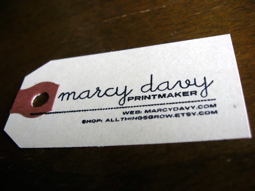

I designed and ordered a self-inking rubber stamp from Vista Print (I scored a half-off deal and paid $8.99!) and am stamping these on simple manila shipping labels. I have been using these shipping labels to tag work for awhile, I love how simple and recognizable they are. My favorite part about these stamps is that they're the first that actually utilize printmaking in their production. I love the little imperfections between one and the next!

Now that all of these merchandising changes are wrapped up, its time to get back to work on the prints that they're selling!

Friday, July 3, 2009

Log-to-Logo

I've been rethinking my logo for awhile now-- tonight I took a little time to work the image in my mind into something more tangible.

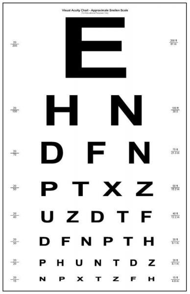
I started by looking for the quintessential mid-century sans serif font. I struck gold when I found Turnpike, from the Font Diner Foundry. I am seriously crushing on Font Diner-- everything in their catalog is amazing! This is a classic, long-haul, trend-resistant font-- I'm looking forward to using it on everything! The more I look at it the more it reminds me of the letter chart they have you read at the optometrist office.


Looks like they stretched it out just a leeetle bit.


I knew that I wanted to substitute the 'O' in GROW with my log print, so I started by cutting it out and making the color more computer friendly.


I quickly realized that it didn't transfer as well on a small level (this particular logo will be as small as 150x50 in some cases) so I started with the O from Turnpike in the same dark brown, and turned it into a log.


I flooded my background with a lovely buff color, added the text in Turnpike, stuck in my log and viola!


and modified for Etsy:


I threw in a blog banner remodel too!

Thursday, June 11, 2009

Celebrate Summer

We always pull together a 'look' for the store entry for each new flyer-- this time we decided to go with 'Celebrate Summer' because it was nice and simple and we're just so glad that the sun is finally here!

I cut down a truck-load of triangle flags from four shades of textured cardstock in fantastic beach-side colors-- and then we hot glued each one to white string at 4 inch intervals and hung them up in long, graceful, 'county fair-like' swags. Adam made all of the signs-- from hundreds of gathered paint chips.


Its really simple, but came together so beautifully.
I love the negative space on the sign.

Here's a closeup of the fabulous paint chip job.


love this 2!


we carried the flags throughout the store. they were the perfect punch of color-- easy to make and effortless to hang. we'll definitely be revisiting them again, maybe with scantron sheets and old lined paper for back to school!


This seemed fitting to post tonight because I'm off to celebrate summer myself-- our first camping trip of the year starts tomorrow! Chris and I are meeting up with our friends Andy and Holly on Lake Michigan for a long weekend. I will be back next week with photos!

Friday, May 15, 2009

Sneak Peeks

I've been stalling on buying more business cards. I get lots of compliments on my old ones, and they match my shop "look," but I was never really sold on them. My plan, should time ever permit, is to screen print designs on card stock and then print out info a clear mailing labels to put on top. A bit like moo cards, but with a handmade spin. I think I really just wanted my cards to feel unique from one to the next. I also wanted type to play more of a starring role than a supporting one-- and that's not really possible in anything you can order.

Then I commited to selling work in Handmade Detroit's multi-vendor shop at Movement, (formerly the Detroit Electronic Music Festival) and realized that if I wanted to truly take advantage of marketing to 80,000 people then I'd need lots of new business cards in a hurry. Like 10 days hurry. So I bought some textured cardstock and went for a skinny horizontal format on my inkjet at home.


I like how they turned out-- I'm still itching to print my own though! The script/western treatment in my shop name is on its way to becoming my new m.o. I think.


My work graced the pages of Design Sponge this week thanks to Chicago designer Amy Allison's home. Amy picked up some work from me last year-- I'm so happy to see it tucked away in her bathroom! She makes really beautiful screen printed textiles and pretty white ceramic work with an etched feel.


Can you spot it?


My piece for IndieFixx's Free Art Project will be up sometime between next week and the end of the month. Here's a little glimpse at the work-in-progress.


You'll be able to download and print the finished piece once its up on the site!

Wednesday, May 6, 2009

Design for Mankind = Food for Brains.

I wanted to share a whole slew of photos today, but I left my camera at work, so I've decided to up the ante and share some video instead. I was tipped off to Design For Mankind's Dialogue Series through contributor Kate Bingaman-Burt (from Obsessive Consumption) and whenever I stop in to check on the series I'm fascinated by the topics of discussion.

Design For Mankind - Dialogue Episode 8 from Design For Mankind on Vimeo.


In this episode the contributors talk about the future of art and design. What Craig Atkinson has to say is particularly fascinating. His basic point is that we saw graphics look really crisp and hi-tech in the 80's and 90's. Design that bears a more handmade aesthetic is something of a reaction to that era-- perhaps the apex of which was Starbucks Christmas 2008. In any event-- what's next? We've come to a place where the most current art of our time bears that sort of home-spun, handmade look. See illustration sensation Julia Rothman, for example. Basic line work like hers is HUGE in illustration right now. Or the entire soundtrack of Juno (which bears a basic line work cover) -- particularly that folksy theme song which you can now hear tweaked on endless mainstream commercials. Commercials which also LOOK handmade! Its everywhere!


As someone who not only participates in this design zeitgeist by hand painting signs 40 hours a week, but also hand painting faux sewn stitches onto handmade signs, I am curious to see what happens next. I recently made this poster for an upcoming MICE show:


Design doesn't get much more handmade looking than being popped into a .jpg of an embroidery hoop. Craig predicts that sleek design will soon make a comeback in reaction to the handmade craze, and even points to some airbrushed work he's recently noticed.


The episode prior is about the influence of blogs in the creative life of artists and designers:

Design For Mankind - Dialogue Episode 7 from Design For Mankind on Vimeo.


Blogs are a huge inspiration point in my work, but I definitely feel like its a bit much sometimes. Working too much from what you see out there on the internet can strip away your own voice if you're not also pulling from abstract, real-life situations. Its easy to feel drawn to work and say "I want to make that!" because you can, not necessarily because its the result of your own creative process. I feel this particularly with looser, more subtle images, but know that my strengths lie in making graphic work. I know that I'm not capable of working in this mode all the time, because its just not how I process visual information.

Its a lot to process-- how the work of our time is influenced by this relatively new global community-- how the handmade aesthetic is almost a reactionary force to our high-tech world and what we might do to push into 'what's next'

In any event, this series is really interesting and well worth a peek!

Sunday, April 12, 2009

The Case of the Mystery Screen Print Panel

My boyfriend recently acquired this crazy vintage screen print panel


and I immediately set out to try to learn more about it. Now I hate to toot my own horn, but I could make a sizeable part-time income as a professional internet searcher-- I am excellent at the Google. I thought I'd find information right away because its huge and really bold.

I poured over Pop and Op art screen printers and vintage textiles. I searched every single visual characteristic and visited countless pages on retro home decor. Eventually I gave up because this panel just didn't provide me with enough clues-- not signed, dated, titled. It was stretched well, but not professionally. So I'd totally given up and resigned myself to the fact that we'd always have this weird print we knew nothing about laying around.

Then today I casually opened up my Apartment Therapy SF Feed (I don't typically even visit the Apartment Therapy blogs because they go up so often its virtually impossible) and I saw
this!


The exact same print! Well almost-- this one doesn't have that extra set of lines that ours does-- so I'm guessing its a little shorter. To see this ever so serendipitously after combing the internet for hours days earlier really freaked me out.

I've emailed the apartment's owner (an Apartment Therapy contributor) and am hoping she can help me solve the mystery. I imagine she probably found it rather haphazardly too, but you never know.


Tuesday, March 17, 2009

Rad Linkage


I have been a printing fool over the last few days and have promised myself that I will pump out another edition tonight, so I will keep it short and instead give you a couple of rad links:

1) Frank Chimero

I don't remember the first time I came across Frank Chimero's site, but I keep finding myself clicking on links I like that take me to it, so I thought I'd share it here. His work is part of a rare category that speaks to me across the board-- with both the signs I make in my day job and in the graphic prints I create on my own time.


(I LOVE that glass of iced tea!)

I particularly love this article from his blog. So many great thoughts on design!

2) PrintZero Studios

I also want to pass around this amazing opportunity to participate in a print exchange! I've only participated in a few print exchanges, but I think they're great fun and also a really unique exhibition opportunity. Seems like they usually have kind of steep entry fees and larger image sizes/editions, but this one is only $10, and you only need to send an edition of 15 5x7"s! The deadline is May 15th, so there's plenty of time!

Today we took the canoe out for the first time this year, it was 65 degrees and sunny in the mitten today!

Back to prints!

Sunday, January 11, 2009

These are a few of my favorite things

I have been meaning to throw out a steady stream of great discoveries, but since I haven't started by now, I'm going to compress what would be several entries of that nature into one. Without further ado, here's a short list of favorite things.

Design Websites

I make the rounds of most of the popular design websites and blogs- and I find the following two to be indispensable.

First up is Print & Pattern, a blog devoted exclusively to current trends in surface design. The entries are great because they're so image heavy, with only the occasionally sprinkled caption. Its my first stop if I'm looking for quick bursts of inspiration. Its constantly loaded with international designers (the writer is British) that I've never seen before. Entries run the gamut from super-cute kawaii designs to intricate and subtle stationary and everything in between. Many of the images are photographs taken by the writer as she stalks out trends both home and abroad. Her entries around the holidays really juiced up our design process at work this year.

Some of the featured work is predictable and all over the design circuit, but a lot of puts a fresh spin on what's going on. The illustration above is a prime example. Birds and flowers in some combination are everywhere right now, but this designer's treatment of them is refreshing-- I particularly love the colors used.

This design comes from the wonderful Lucy Clarke, via Print & Pattern.


The second website is as specific as Print & Pattern is general. Grain Edit shares work with very specific mid-century aesthetic references, and if it happens to be your thing then you're going to think you've died and gone to blog heaven. The mix of old and new is awesome, and sorting by tags allows you to read entries specific to an era or style. Here's a sample of the delicious goodness they dig up:


I know, right? I lovelovelove everything about this little vintage hotel tag, especially the combination of sleek modern script with utilitarian sans-serif fontage. And the color, and the shapes, and the screen-print looking feel with the white outline...


Entertainment
The first movie I'd like to talk about is the worst movie I have ever seen. Ever. I'm discussing it simply because its so bad you have to see it. The Happening, starring Mark Walberg is about an act of airborne eco terrorism caused by plants. (possibly) This movie is so incomprehensibly bad from start to finish I wouldn't even know where to start-- the script is terrible, the directing is some kind of nightmare (made obvious by Zooey Deschanel's terrible performance despite the fact that she's normally such an amazing actress). It was so bad that the New Republic compiled a list of its worst moments here. I would highly suggest you watch it-- if for no other reason than to see people try to run from the wind and to cringe over the world's creepiest old doll.

On the opposite end of the spectrum, I watched the pilot for Showtime's United States of Tara this weekend, you can check it out on Fancast. Toni Collette plays a mom with dissociative identity disorder and John Corbett of Sex and the City fame plays her sweet husband. They have a pair of highly dysfunctional kids, and a whole array of personalities that Collette plays with amazing hilarity. The Season 2 premiere of Flight of the Conchords is also available on Fancast, and is just as funny. I'm so glad HBO brought it back.


My storage closet is bursting at the seams, and I will be announcing a sale tomorrow. You might even go so far as to say it'll be a blowout. Its time to clear away the old so I can make the new-- I'm starting to think about what shows I might like to apply to over the summer.