
I'm loving a good mix of script and classic mid-century sans-serif right now, so these two make a sweet pair. I've been doing the same in my signs at work, but with Black Jack type face, because the changing line weights and crispness seem to work well on an advertising level. Here's examples.
 You might recognize Black Jack from BohBon Soap's super-sweet packaging.
 Speaking of soap, Chrissy at BohBon makes some heavenly soaps that are nice and gentle and smell pleasing and earthy. I'm a big fan of Gypsy Spice and Earth Mama Goat Milk. And, I haven't smelled Rifferaff's soaps yet, but Shannon wraps them in hand-printed paper and uses real Michigan honey in them and they look good enough to eat!
Last tangent, I swear. So when the time came to put together some retail packaging, I used these fonts again. This is some drawn and scanned woodgrain, with a title on the front, info and links on the back, and a cute little retro price circle. I added the leaf on the other side for some balance.

Next, I reimagined my business cards. For the fourth time this year. I'm not even kidding-- take a look!
 The top left was my first card. I threw it together very quickly last summer, printed it on some cardstock, and cut it up myself. Late last year, I started ordering them from 123Print, which has a lot of sweet contemporary designs-- this one was perfect. When I was in a pinch because I never remember to order more, I spent an evening printing them up on my ink-jet at home on textured cardstock in a long skinny ticket size and cutting them by hand. That particular incarnation has the most info on it-- too much in my opinion. When it came time to COMMIT to a design for awhile, I decided that I wanted something that was simple and had a handmade feel.
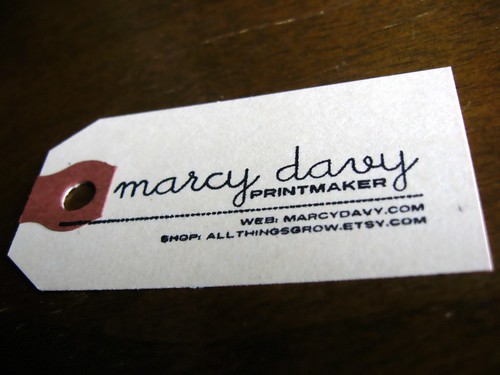
I designed and ordered a self-inking rubber stamp from Vista Print (I scored a half-off deal and paid $8.99!) and am stamping these on simple manila shipping labels. I have been using these shipping labels to tag work for awhile, I love how simple and recognizable they are. My favorite part about these stamps is that they're the first that actually utilize printmaking in their production. I love the little imperfections between one and the next!
Now that all of these merchandising changes are wrapped up, its time to get back to work on the prints that they're selling!


No comments:
Post a Comment