Showing posts with label banner. Show all posts

Friday, July 3, 2009

Log-to-Logo

I've been rethinking my logo for awhile now-- tonight I took a little time to work the image in my mind into something more tangible.

I started by looking for the quintessential mid-century sans serif font. I struck gold when I found Turnpike, from the Font Diner Foundry. I am seriously crushing on Font Diner-- everything in their catalog is amazing! This is a classic, long-haul, trend-resistant font-- I'm looking forward to using it on everything! The more I look at it the more it reminds me of the letter chart they have you read at the optometrist office.

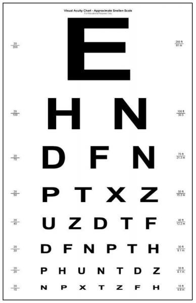
Looks like they stretched it out just a leeetle bit.


I knew that I wanted to substitute the 'O' in GROW with my log print, so I started by cutting it out and making the color more computer friendly.


I quickly realized that it didn't transfer as well on a small level (this particular logo will be as small as 150x50 in some cases) so I started with the O from Turnpike in the same dark brown, and turned it into a log.


I flooded my background with a lovely buff color, added the text in Turnpike, stuck in my log and viola!


and modified for Etsy:


I threw in a blog banner remodel too!

Friday, February 13, 2009

A very slight shop update

I spent tonight tweaking my shop banner a bit-- I think my photoshop skills are slightly improved since I last made it, and wanted it saved as a .png so its a little less fuzzy

I'd throw up a before and after for comparison, but I just realized that I don't have a before anymore! I bought a new computer this week and its either hidden in some super secret folder from my old files or the banner on etsy was my only copy!

Anyway, here's the new banner:


The back image has changed to a plant cell diagram, the text color is a little lighter than it was before, and I filled the little tree with a different woodgrain and refined it a bit. Just for fun (and because I was curious about this font) I made an entirely new banner as well:


I love how this turned out-- the font is really unique and the distressed look came together nicely. It just doesn't seem to match up with what I'm trying to do though-- there's something about it that doesn't do it for me-- too old fashioned maybe. I'll actually save this one though (what a concept!) and maybe pull it out in the future. It might work nicely with this group of prints I'm stringing together right now.

Speaking of new prints, I've started some sketches for this new series of prints and made a lot of choices already about which direction I'll be going in. One of my goals with this blog was to share the total process of screen and woodcut prints from idea inception to matting and framing, so look for the first post of that series in the next few days. Instead of working print by print, I'll be carrying this new work through each step at the same time and making much larger editions than before, so it'll be a journey worth documenting.